Case Study: Building an End-to-End Executive-Facing Client Health Dashboard
Client: Software Company that supports business-to-business customer accounts
Project Focus: CSAT (Customer Satisfaction) metrics, data pipeline automation, executive metrics reporting
Role: Lead Engineer (pipeline creation and orchestration, dashboard buildout)
I. The Challenge
The company’s executive team wanted a single dashboard that showcased current and reliable customer health and satisfaction data across the customer lifecycle, as well as historical customer satisfaction data to compare against. Data was dispersed among various databases and some key performance indicators (KPIs) were not being pulled from Salesforce on a regular basis.
The executive team needed a daily dashboard that could:
Track customer satisfaction metrics across accounts and Customer Support Agents
Alert the executive team to at-risk clients
Assist data-driven decisions in client prioritization and renewal discussions
II. The Solution
Ben designed and built out a robust, automated data pipeline from the source system to the database, and then to the dashboard where metrics were presented clearly to the executive team.
1. Data Pipeline Engineering
Designed and built an automated data transfer pipeline to extract source data such as:
Client Net Promoter Score (NPS)
Frequency and severity of submitted support tickets
Renewal status and contract terms
Staged and validated the data in a database prior to pulling into dashboard
Included steps to check for data cleanliness and validate mandatory data points
2. Dashboard Development
Built out an executive-facing dashboard that tacked:
Client NPS and support ticket trends by account, Account Manager, and time of year
Low CSAT and at-risk clients (e.g., decrease in CSAT scores, high volume of high severity tickets)
Actions taken by the Client Success Team to improve at-risk relationships and mitigate future churn
Aggregate CSAT metrics by region, size, account rep, and historical CSAT
Designed visualizations with brevity and informativeness as top of mind, ensuring the executive leadership team saw what was most important to them first and offered drill-down tables for deeper analysis
3. Stakeholders and Delivery
Partnered and worked directly with the VP of Customer Success
Built the pipeline in such a way that it could be scaled if additional metrics were to be included in the future
Provided documentation and an overview of the end-to-end process to hand off to the technical lead for the Customer Success Team
III. The Outcome
Streamlined and consolidated the information that the Executive Team needed to make data-driven decisions
Data burden dropped from hours-long monthly manual exports to automated daily refreshes
The Leadership Team uses the dashboard to inform strategy around at-risk clients
The dashboard brought alignment to the Product, Customer Success, and Executive teams
IV. Why It Mattered
The Project aligned teams around a shared view of customer health and moved the company away from instinctual client prioritization to data-driven client insights. In building both the data pipeline and the dashboard, Ben ensured data quality, reliability, and access to real-time insights that empowered the Executive Team to prioritize their customer strategy with greater confidence
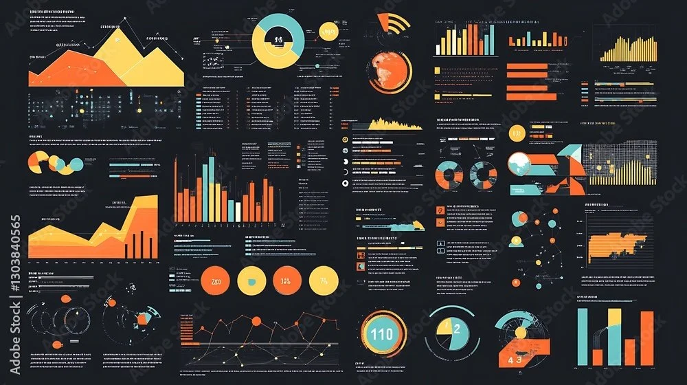
Examples of how we can track metrics and visualize important findings
-
![]()
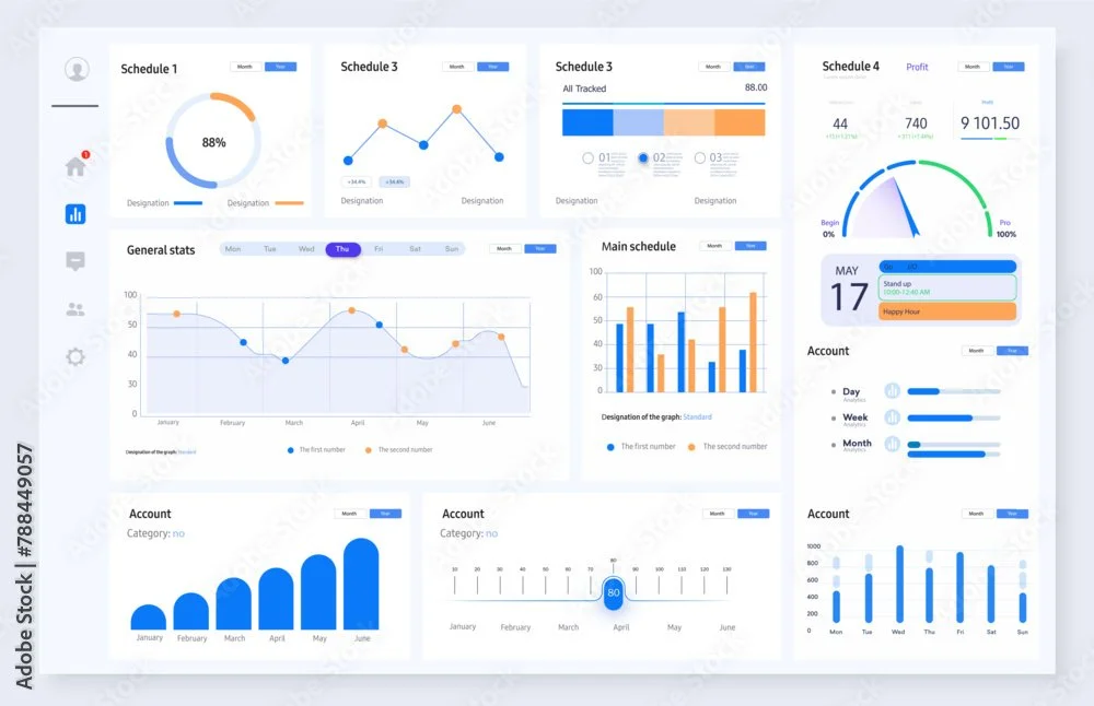
How it’s made
-
![]()
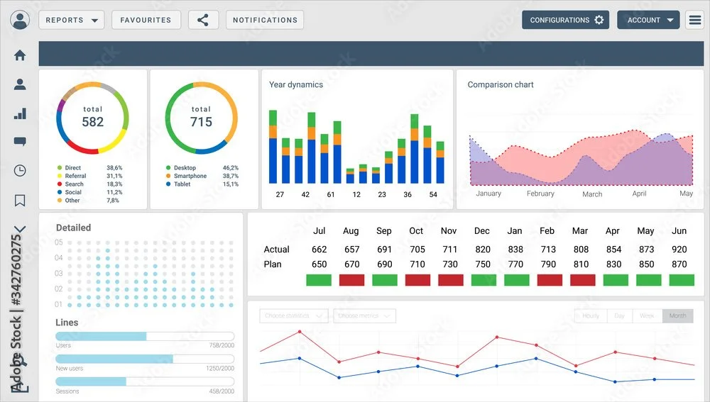
Analysis for any event
-
![]()
See only the most relevant and important information
-
![]()
Leverage real data to drive growth